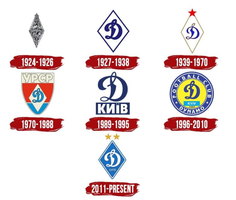
History of the FC Dynamo Kyiv Logo

Since its foundation in 1927, FC Dynamo Kyiv has been a prominent Ukrainian club. It reflects the constant development and, at the same time, the continuity of Ukrainian football traditions. Regardless of the type of tournament, every top bookmaker online covers Dynamo Kyiv games. For example, open the GG.BET betting site and find a distinctive blue-and-white logo in multiple sections with domestic leagues, European competitions, and more.
The club’s logo has become one of the most well-recognised among all other clubs. The badge has also been constantly evolving, while keeping the iconic “Д” untouched. Each subsequent logo’s design is not only about visuals. These changes reflect the club’s philosophy and a long journey through the ages until Ukrainian independence. Let’s explore every change in the club’s logo and its meanings.
1924-1926: First Steps
Before the official foundation of the football club, Dynamo Sports Society offered a short black-and-white rhombus as an emblem. It contained multiple small sports-tailored elements (not only related to football) and was crowned with a soviet star. The logo was created in 1924 and was active for two years. A distinguished feature was the name of the club in the central part of the badge, made in a handwritten font.
1927-1938: Birth of the “Д”
In 1927, the logo accepted the usual Cyrillic “Д” symbol written by hand. In this variation, it has a dark blue color and is located inside a white rhombus. An elegant outline has the same color gamma.
1939-1970: Club’s Recognition
During this period, the club had a series of significant wins, which made FC well-recognizable and led to logo changes. Among them is a complete break of Moscow’s dominance in the soviet football world and winning the top leagues. Also, Dynamo Kyiv managed to win the first and second soviet Cups.
At this time, the logo received a much thinner and lighter outline with a slightly bronze tint. The frame of the rhomb also got a bronze color and became much thinner. A new variation of the logo had a big red star in the upper corner of the rhomb. The club retained this badge well into the 1960s.
1970-1988: Dramatic Changes
During this period, the logo retained the rhombus. However, the outlines became blue. Also, they removed a red star from the upper part and added other elements. Among them is a round shield with the diamond-and-”Д” badge sat beneath the Ukrainian SSR title atop it. The logo was designed with blue and red stripes from the flag. These are the main colors that form the backdrop.
1989-1995: A New Professional Identity
In 1989, Dynamo Kyiv was established as an independent football club, which brought significant changes to the logo. Now it was redesigned with a fan-oriented look, having undergone a minimalist redesign. A bold blue “Д” symbol floated above the Ukrainian name “КИЇВ” on a completely blue rectangle.
After independence in 1991, the city’s name turned yellow. This was a clear homage to Ukraine’s national flag. With this logo, the club entered and (and impressively won) the Inaugural Ukrainian Premier League. The club became champions of the first-ever Ukrainian Top Division in 1992. That was the time when Dynamo Kyiv set the tone for domestic dominance.
1996-2010: A Circular Emblem
In 1996, the design of the logo changed completely, except for the big “Д” letter that remained in the center of the badge. It was placed in the middle of the yellow circle. In the lower part of the badge, there was a turquoise plaque with the name “KYIV”.
Right below the plaque, there is the year “1927” in blue. Also, there was a thin blue ring around the yellow circle that contained the words “DYNAMO” (in the lower part) and “FOOTBALL CLUB” (in the upper part). All three words are written in white font.
2011 –Today
The current visual identity of the FC Dynamo Kyiv is minimalistic yet stylish. It is made of fairly laconic but memorable blue and white colors. The blue adds elegance and freshness to the logo. It reflects the sense of freedom, dynamic, speed, movement, etc.
The badge contains a blue rhombus with two outlines (blue and white). It does not have sharp angles and is a bit elongated, which makes it look sleek. The central part of the badge, traditionally, is occupied by the “Д” letter in cursive. It has bold and perfectly rounded lines that make it look like a boat with a big white sail.
Right under the “Д” symbol, you can see the “КИЇВ” inscription. It is also white and executed in a sans-serif typeface. The only colorful elements of the logo are located in the upper part: these are two golden stars, which symbolize FC Dynamo Kyiv’s wins.
Last Updated on September 15, 2025

